Affiliate Disclosure: We may be compensated if you use our links to make a purchase. We are extremely selective in who we partner with & only recommend products we believe in. Our affiliate relationships do not influence our recommendations.
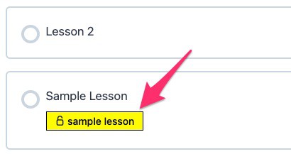
If you’re using LearnDash sample lessons in your course, a “sample lesson” label is added to the course content list, as well as in the sidebar of focus mode. Do you want to customize the way the sample lesson label looks?
This article will show you how to customize the label’s colors, borders, overall design, and more.

LearnDash Sample Lesson Label CSS
You can do many things with the LearnDash sample lesson labels. First, I’ll include the entire CSS to update them. Then I’ll break down what each property does, and how you can change it.
.learndash-wrapper .ld-status.ld-status-unlocked {
    border-radius: 0;
    border: 1px solid black;
    background: yellow !important;
    color: black !important;
    letter-spacing: 0;
    text-transform: lowercase;
}
.learndash-wrapper .ld-item-list .ld-item-list-item .ld-item-title .ld-status {
    font-size: 14px;
    font-weight: 500;
}
.learndash-wrapper .ld-status-unlocked .ld-icon-unlocked {
    display: none;
}
In the first section of the CSS, we’re targeting only the “sample lesson” label.
border-radius: change the rounded corners of the labelborder: change the width, style, and color of the border. Use0for no border.background: change the background color of the label. Usenoneto eliminate it.color: change the text color of the label.letter-spacing: LearnDash adds a little letter spacing. If you’d like to remove it, use a0here.text-transform: LearnDash forces it touppercaseby default, but you can uselowercase,capitalize, orinitial.
NOTE on !important
Typically, using !important is not a best practice. However, if you’ve set colors in your LearnDash settings, LearnDash applies the !important declaration, which means in order to override it, you also have to use it.
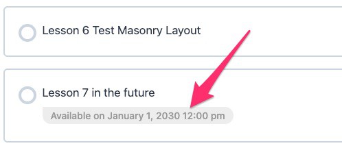
The next section will appear to both the “sample lesson” label and the “available on…” label used for lessons that have yet to be released. This will allow you to change the font size and weight.
font-size: Use any value you’d like here.font-weight: Usenormal,bold, or a supported number value.
The third and final section with .ld-icon-unlocked is only if you want to remove the lock icon. If you want to keep it there, delete this code.

LearnDash Sample Lesson Lock Icon in Focus Mode

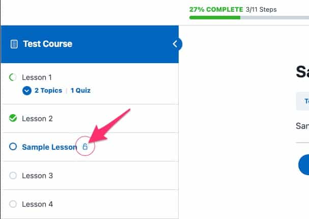
There’s also a little unlocked icon that appears in the sidebar of LearnDash focus mode for all sample lessons. You can update the colors for that icon with the following CSS:
.ld-focus-sidebar .ld-status-icon.ld-status-unlocked {
    background: red;
    color: black !important;
    width: 20px;
    height: 20px;
    flex-basis: 20px;
}
The only two lines that are needed here are the background & color. However, LearnDash does not apply any padding around the edges of the icon for the background circle, so that’s what I’m doing by setting those other 3 values to 20px. LearnDash makes them 15px, which in my opinion, is too small.
LearnDash “Available On…” Label CSS
You can also customize the “available on…” label that LearnDash uses for drip content that has not been released yet. Here’s the CSS for that; it works in much the same way as above.
.learndash-wrapper .ld-status.ld-status-waiting {
    border-radius: 0 20px 20px 20px;
    background: #ededed !important;
    color: #999 !important;
    letter-spacing: 0;
    text-transform: initial;
}
.learndash-wrapper .ld-item-list .ld-item-list-item .ld-item-title .ld-item-components .ld-icon-calendar {
    display: none;
}
Again, the .ld-icon-calendar code is only there if you want to remove the calendar icon.
In this example, the border-radius has 4 different values, one for each corner of the label, starting from the top-left and going clockwise.
If you’re not sure where to add custom CSS for LearnDash, please watch this video.
If you have any other questions about LearnDash sample lessons or how to customize their design, please let me know down in the comments.
Yana Galay
Hello, thank you so much for this explanation. It’s a great article! I have been trying to use the same CSS to change the color of the label, but it seems that the default value overrides it. I tried adding !important, but maybe I am doing something wrong.. Could you please help? Thank you in advance!
Dave Warfel
Hi Yana — I’d be happy to help. Shoot me an email at [email protected], and please provide a login to your site, along with a link to the course that has a sample lesson in it. I’ll take a look.
Dave Warfel
For anyone else who sees this, I solved Yana’s issue, and updated the CSS in this article to make sure it works in more scenarios. Yana was using LearnDash’s 3 color options, which, when used, apply very specific CSS that was overriding my original code. I have updated it to account for this.
Yana Galay
Dave, thank you so much, it really helped! I have a consecutive question: when I enter the course, the sample lessons are accompanied by the small circular icon of an unlocked lock. Is there any way to modify its colors and where should I enter the CSS?
Dave Warfel
Of course there is 🙂
I just updated the article with the CSS for that, but here it is as well.
You can add that just after the code you added for your other sample lesson label styles.
Luna
Hello! How can I change the icon to a different one?
Dave Warfel
LearnDash uses font icons for everything, so one way would be to create and upload your own icon font with the icons you want to use. You can do this via icomoon.io. Then apply some custom CSS, changing the
font-familyto your icon font instead of LearnDash’s, and using thecontentvalue for the::beforepseudo-element.See this screenshot for CSS reference.