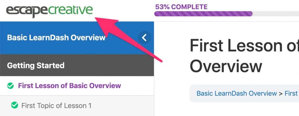
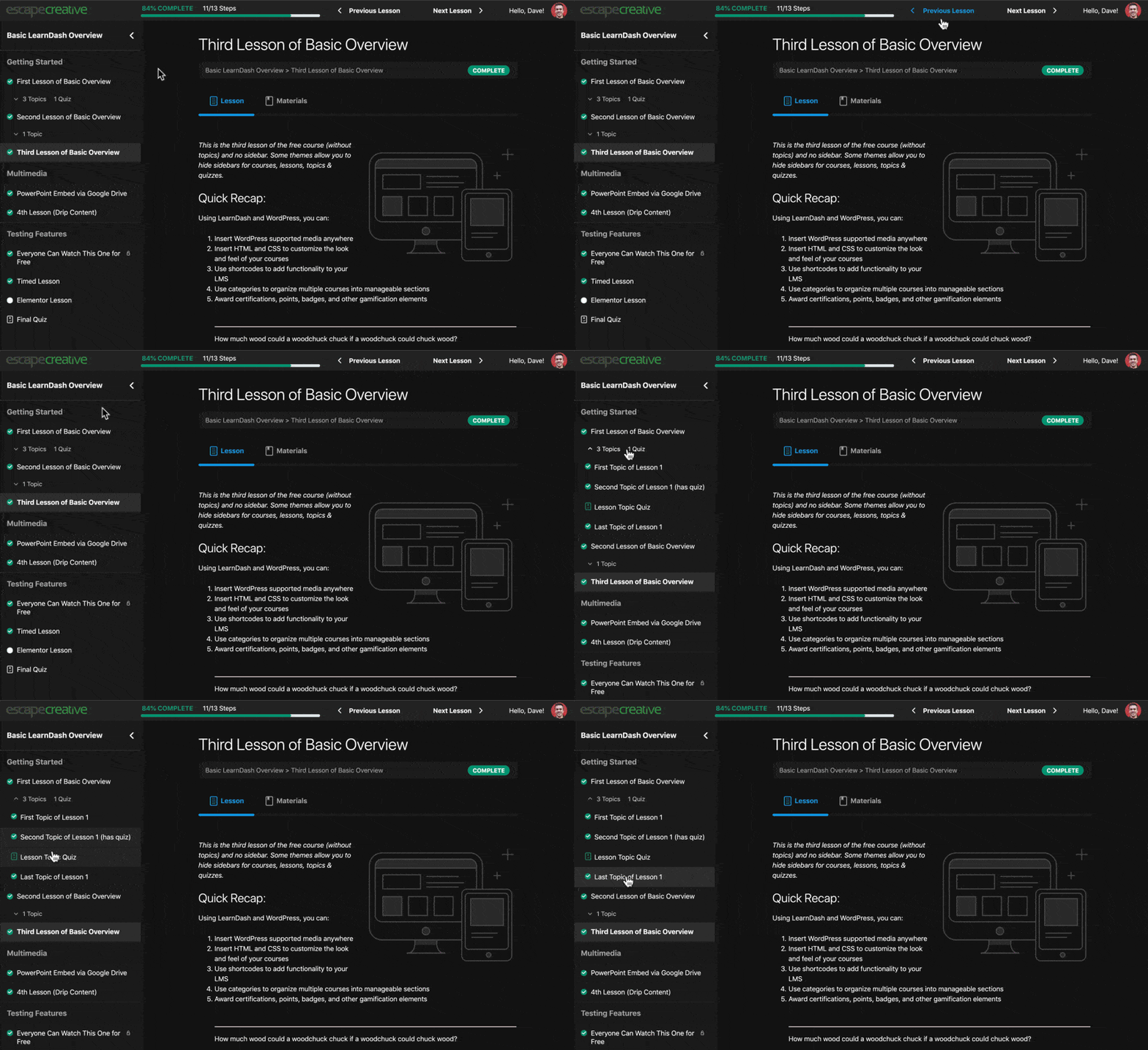
As most of you know by now, LearnDash 3.0 was released on May 28, 2019. Several of you have asked how Design Upgrade Pro for LearnDash works with the new version.
This article will answer that question, provide an update for what we’re planning in the coming weeks & months, and lay out a timeline for when it’s all happening.
UPDATE: June 23, 2019
Design Upgrade Pro is now 100% compatible with the LearnDash 3.0 active template, including 20+ new options for focus mode, profile, tooltips & more.
Don’t worry, you can continue using all the old options with the Legacy template. Our plugin automatically detects the template you’re using, and provides different Customizer options for each 🙌.
We’re still working on videos & updating our product page, but rest assured, there are TONS of awesome features available right now for 3.0 😀.
For the rest of this article, if I mention “3.0,” it is in relation to the “LearnDash 3.0” active template, NOT version 3.0 of the LearnDash plugin. You can safely update to version 3.0 of the LearnDash core plugin.
“Legacy” vs. “LearnDash 3.0” Active Template
- If you’re upgrading from LearnDash 2.x, you will default to the Legacy template. You can continue to use Design Upgrade just like you always have. You shouldn’t notice any difference on the front-end of your site.
- If you’re brand new to LearnDash, and starting with version 3.0+, you’ll default to the LearnDash 3.0 template. Design Upgrade works with either template, so feel free to switch back & forth to find the design you like best.
Good News!
- Design Upgrade Pro is now fully compatible with the LearnDash 3.0 template.
- We will continue to support those who want to remain on the Legacy template (for as long as LearnDash provides it as an option) 👊.
- Because LearnDash 3.0 adds several new features, there are more opportunities for improved design. We’ll be releasing new features somewhat steadily over the next several months.
Phase 1
Our first step is to port over as many existing styles from the Legacy template as we can to the 3.0 theme. Because the 3.0 design is structurally unique, and outputs some different content than the Legacy template, not all current features will be available in 3.0 (but we’ll maintain Legacy support so you can continue to use the plugin exactly as you are today, if Legacy is your jam).
The 3.0 template still supports…
- all progress bar styles
- most course grid styles (ribbon colors were excluded in 3.0)
- most course navigation widget styles
- most course content table styles (and a bunch of new ones 😍)
- all button styles (we added hover styles in 3.0 👍)
The course content table options will look different for users of the 3.0 template. That’s because the entire layout has changed, and the same options just don’t apply. But we have added options to customize the course content table, and they’re even better than in LD2.
Phase 2
Phase 1 is complete, and there are already more options for the LD3 template than there were for Legacy. But we’ll continue to add new features over the coming months.
FEATURE REQUESTS
If you have specific feature requests for design customizations you’d like to see with the 3.0 template, please leave them in the comments.
Possible New Features for 3.0
- Breadcrumbs: hide them globally (you can already do this on focus mode pages), change the bg color
- Alerts: several color options for alerts, broken down by type (regular, warning/error, success/completion, etc.)
- Profile: possibly adding 1-2 different layouts for the top section
- Status Labels: possibly adding color options for status labels
- Login/Registration: colors, shadows, sizing options
When?
Phase 1: Completed on June 23, 2019
Phase 2: New features will begin rolling out for the 3.0 template gradually, based on user feedback (so please comment below what you’d like to see).
Help
As always, I’m here to help. If you have any questions at all, don’t hesitate to ask. [email protected]
Thank You 🙂
And a big thank you to all of those who have supported me so far by using and/or purchasing the plugin. The reaction was far better than I ever expected, and you have inspired me to continue innovating and building a better product. So thank you 🙏.
I also greatly appreciate your patience. I know many of you were eager to get your hands dirty with those new 3.0 features. I would’ve loved to have all this ready for the launch on May 28th, but I pride myself on remarkable craftsmanship, so the wait time ensured I could produce the same quality of work you’ve come to expect.
I have done everything in my power to over-deliver 👊.
FAQ
Will you continue to add new features to the Legacy template?
Probably not. The current feature set will remain, and we’ll continue to provide support if you have questions, but all future updates & features will be dedicated to the 3.0 template.
Design Upgrade for LearnDash 2.0 (Free) (Changelog)
A lot of work went into the free version of Design Upgrade for LearnDash 2.0, which brought about compatibility with the new “LearnDash 3.0” active template. We kept track of most of the noteworthy changes we made. It’s not 100% exhaustive, but if you don’t like surprises, you can read through this list to get an idea what will happen if you’re using the “LearnDash 3.0” template and upgrade to version 2.0 of our plugin.
If you’re still on LearnDash version 2.x, or using the “Legacy” template, you will not see any changes. Things will continue to work as they always have.
Global
- Revert font sizes & line height to the theme’s default, instead of forcing 16px & 1.5em respectively.
- Status Indicators: Remove letter spacing & adjust font size
Focus Mode
- Focus Mode: Sidebar Tray: Adjusted spacing throughout
- Focus Mode: Sidebar Tray: Larger clickable areas for lessons & topics
- Focus Mode: Sidebar Tray: Reduced the overall vertical space that items occupy
- Focus Mode: Sidebar Tray: Added hover effect to lessons & topics
- Focus Mode: Sidebar Tray: Flip arrow based on collapsed or open status
- Focus Mode: Sidebar Tray: Improve legibility of collapse arrow
- Focus Mode: Sidebar Tray: Added shadow on mobile
- Focus Mode: Sidebar Tray: Added bottom border to course title
- Focus Mode: Sidebar Tray: Remove icon next to course title
- Focus Mode: Sidebar Tray: Remove border when sidebar is collapsed
- Focus Mode: Sidebar Tray: Added background color to section headings
- Focus Mode: Sidebar Tray: Made the final quiz function like the lessons
- Focus Mode: Avatar/Menu: Rounded corners on menu to match course content lists
- Focus Mode: Avatar/Menu: Added drop shadow to menu
- Focus Mode: Avatar/Menu: Removed opacity on hover; added highlight
- Focus Mode: Avatar/Menu: Adjusted padding on items; added min-width
- Focus Mode: Avatar/Menu: Removed bold from menu items
- Focus Mode: Avatar/Menu: Added dividers between menu items
- Focus Mode: Avatar/Menu: Capitalized user’s name
- Focus Mode: Avatar/Menu: Added hover effect on avatar
- Focus Mode: Top Bar: Improved Prev/Next navigation buttons; added hover effect
- Focus Mode: Top Bar: Improved hover effect for Mark Complete button
- Focus Mode: Logo: Reduced vertical padding so the logo image is displayed larger
- Focus Mode: Increased font size of “Back to Course” link
Profile
- Profile: Search: Improved font sizes & styles
- Profile: Search: Improved
<input> field styles
- Profile: Course List: Removed extra space below “Course Progress” area
- Profile: Course List: Removed “Course Progress” label; % & steps moved to the left
- Profile: Course List: Adjusted spacing around assignment & quiz lists
Login & Registration Modal
- Login/Registration: Added border-radius to input fields
- Login/Registration: Changed font sizes & colors to theme defaults
- Registration: Fixed up input fields & spacing as best I can
Assignments
- Assignments: Added red hover color on delete icon
- Assignments: Removed bold from uploaded assignment title
- Assignments: Increased length of “status” column so status fits on one line
- Assignments: Upload: Adjusted padding for filename to allow for more characters
- Assignments: Upload: Several font adjustments
Breadcrumbs
- Breadcrumbs: Removed bold font weight
- Breadcrumbs: Increased font size
- Breadcrumbs: Mobile: Remove 100% width of status indicator
Tooltips
- Tooltips: Styles: removed bolding, adjusted border & font size
- Tooltips: Added a slide-up effect
Pagination
- Pagination: Styles: Removed bolding, adjusted font size
- Pagination: UX: Larger clickable area for prev/next arrows
- Pagination: Center align all instances
- Pagination: Make width consistent across all instances, and expandable to account for infinite number combinations
Progress Bar Widget
- Progress Bar: Increased font size
- Progress Bar: Moved stats to the left
Course Status Area
- Course Status: Not Enrolled: Mobile: Reduced spacing
Course Content
- Course Content: Increase font size in a few spots
- Course Content: Mobile: Improved styles (reduced spacing, full-width clickable areas)
- Course Content: Remove unnecessary bolding & capitalization (% complete)
- Course Content: Added background color on hover (topics)
- Course Content: Reduce size of grey footer area when there’s nothing in it
- Course Content: Removed extra space above/below assignment file uploads
- Tabs: Added hover color
Widget: User Status
- Adjusted spacing & font sizes
Course Grid
- Course Grid: Improved spacing throughout
- Course Grid: Updated some text colors to inherit theme styles
- Course Grid: Standardized border style & radius throughout
- Course Grid: Standardized buttons to match LD3 buttons
- Course Grid: Bolded course titles
- Course Grid: Faded short description text color
- Course Grid: Removed spacing/margin from empty
<p> tags
- Course Grid: Equal height columns
- Course Grid: Buttons & progress bar aligned at bottom of grid items
Uncanny LearnDash Toolkit
- Resume Button: Inherits default LearnDash button styling


